
Mondays E-com Restructure
UX/UI, Site Architecture, Shopify Integration
Monday’s product catalogue had grown significantly over time, making it increasingly difficult to navigate and understand. I restructured the website and shopping experience to create clarity, improve product discovery, and align the site with business goals which was a focus on online e-com.
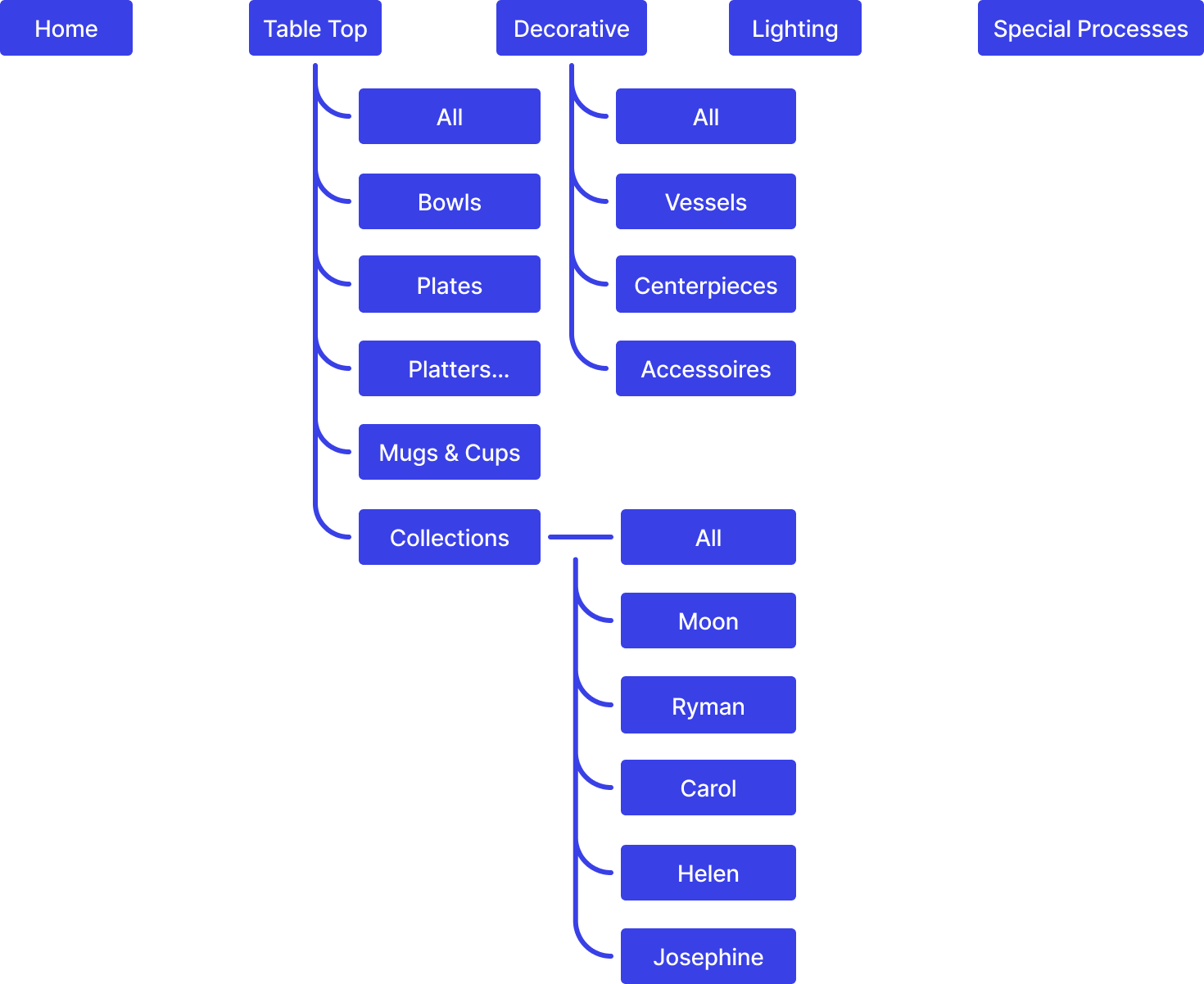
Structure & Navigation
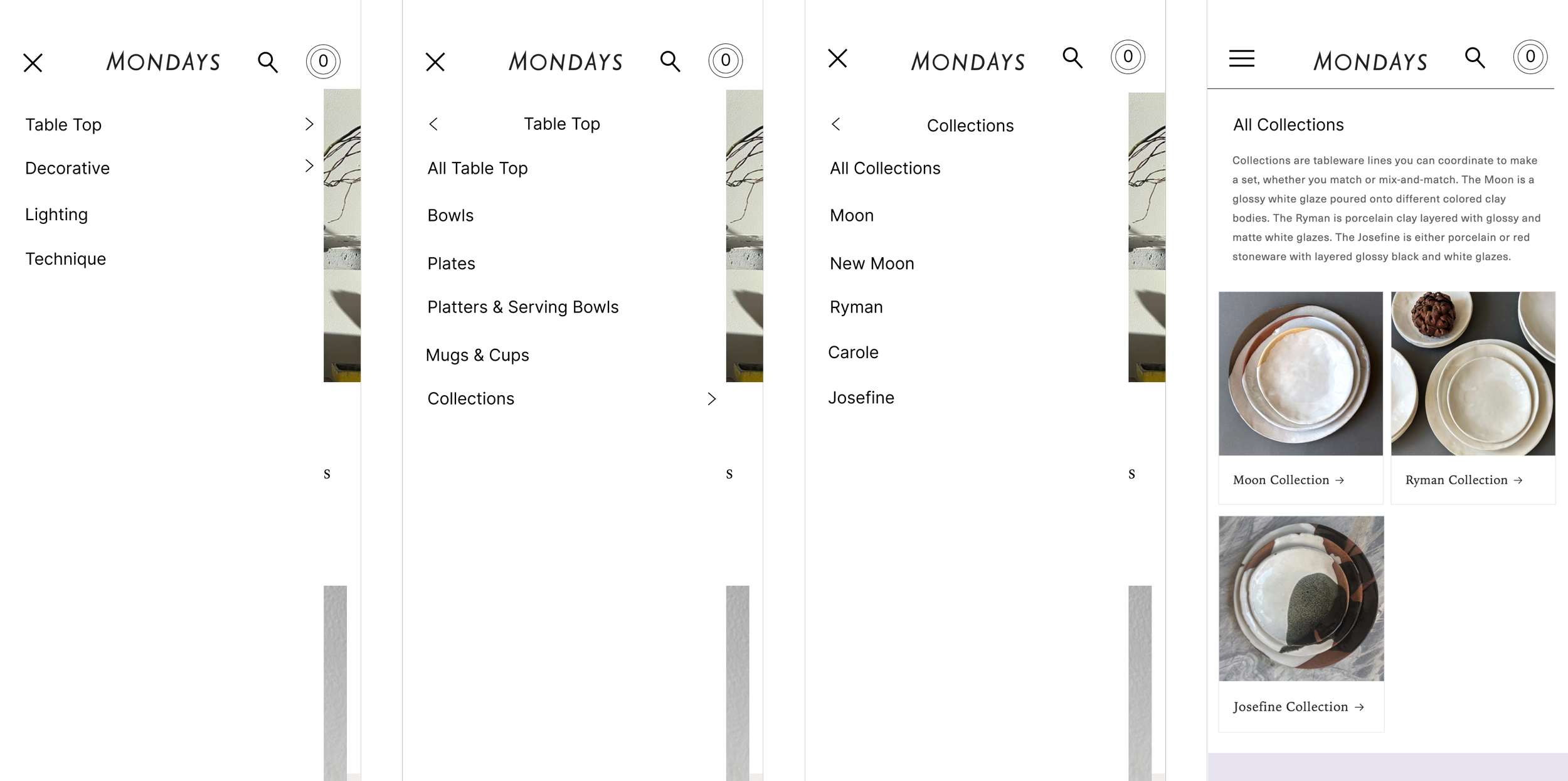
I developed a new site architecture and restructured the product catalogue to create a clearer, more consistent experience. This included redefining categories, unifying product naming, and simplifying navigation so users can quickly understand and explore the range.
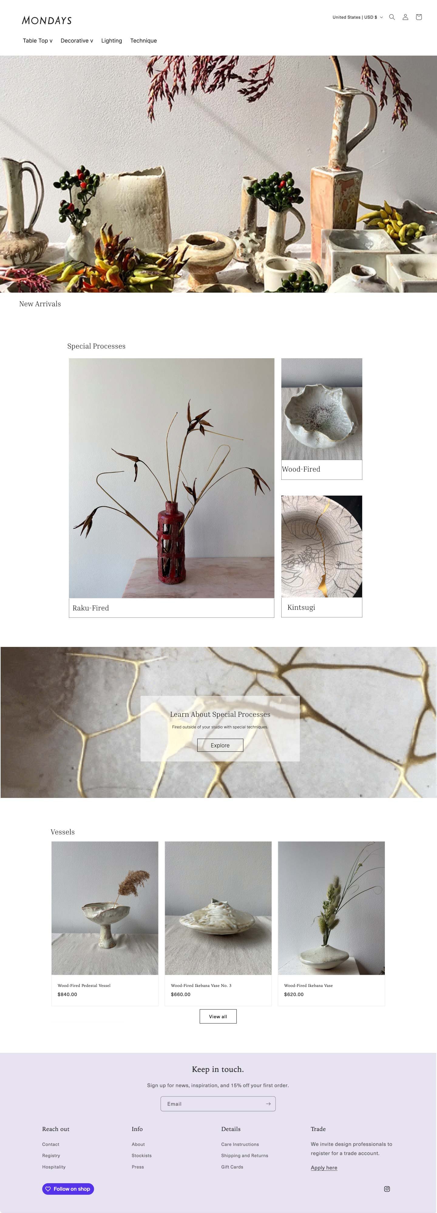
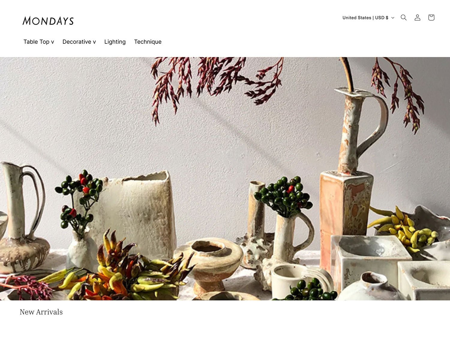
Window Shopper
The experience was designed to support different types of users, from casual browsers to more goal-oriented shoppers. Large, detailed imagery invites users to browse and explore.
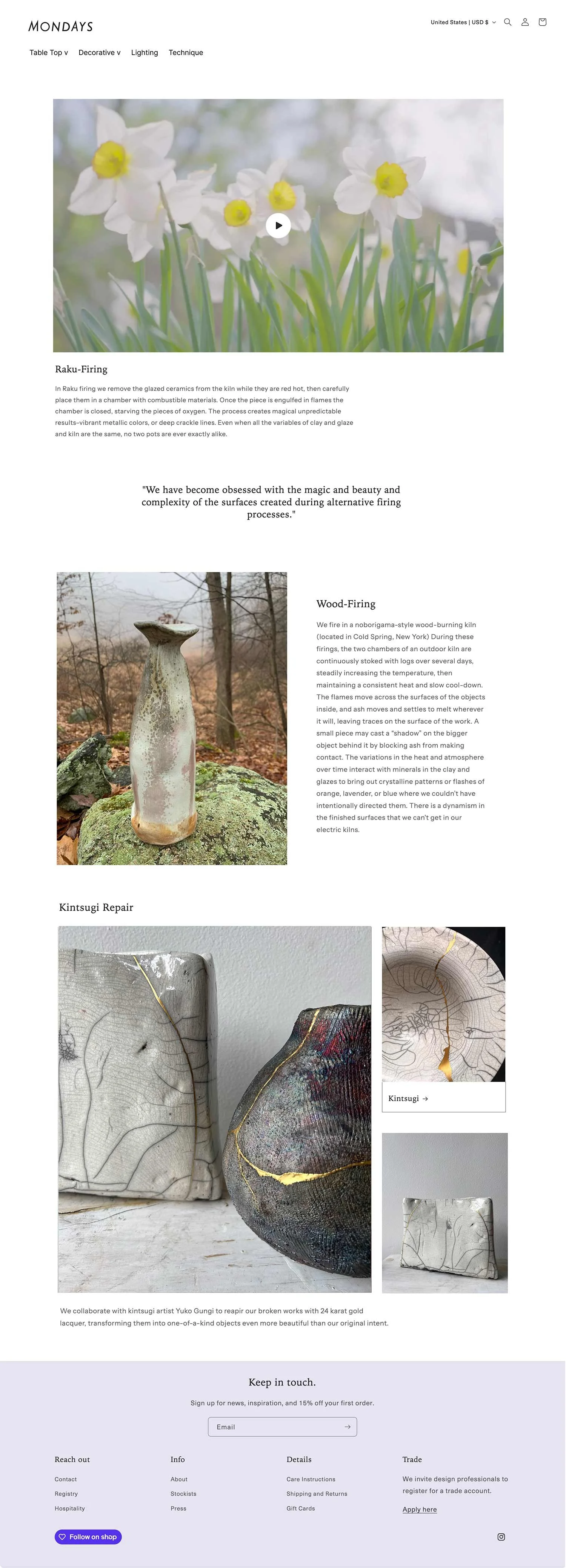
The homepage highlights Monday’s unique firing techniques and links to related products, including a dedicated “Special Processes” section.
Research Shopper
A streamlined structure and consistent naming system allow users to quickly find, compare, and navigate products.
Outcome
The new structure improved clarity across the site and aligned the user experience with business goals.
20% increase in followers
15% growth in retargeting audience
15% increase in newsletter sign-ups