
Rosarium World
Brand Identity
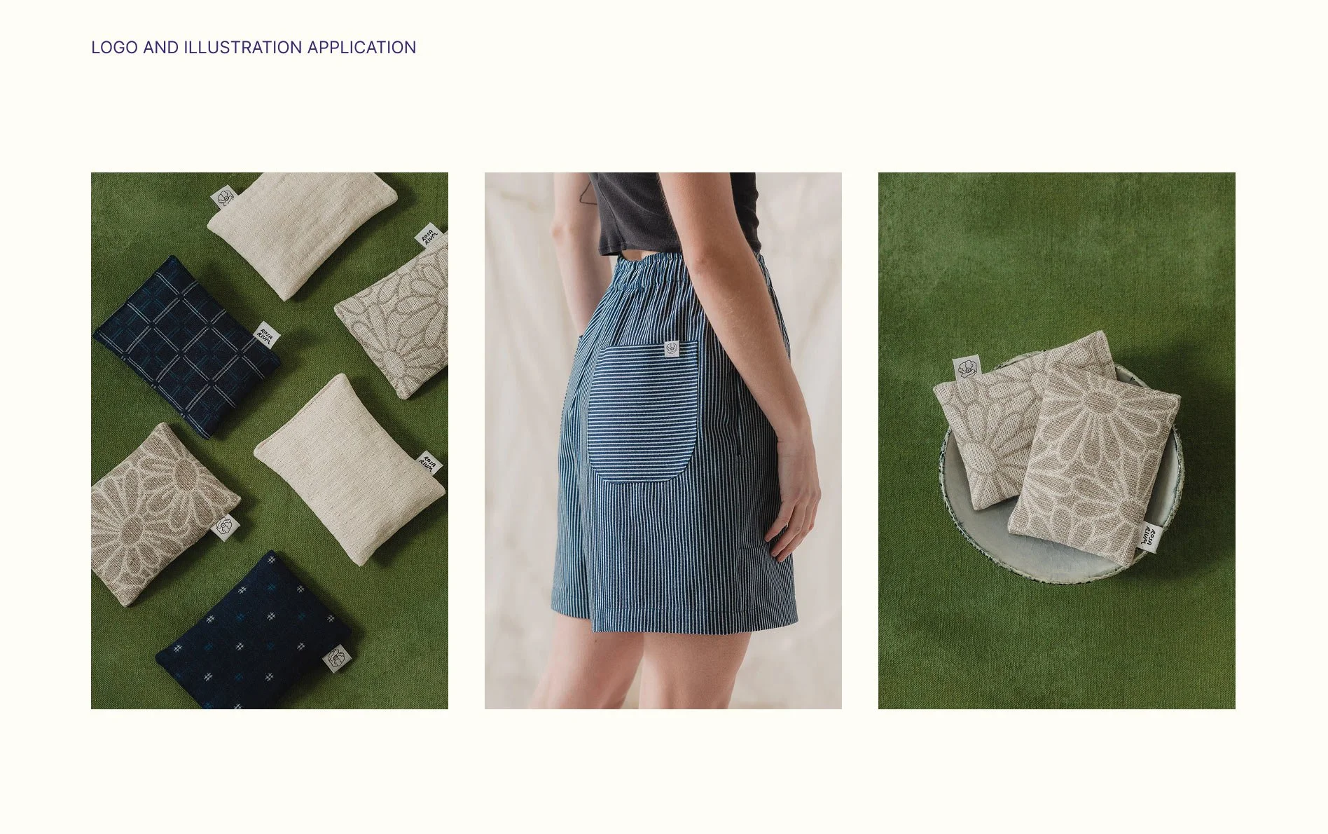
Logo, color palette, illustrations.
Rosarium is a sustainable fashion line inspired by the artist’s garden. The brand needed a clear visual identity that reflects both the aesthetic and the process behind it—gardening as something organic, hands-on, and slightly unpredictable.
The challenge was to express this balance between beauty and rawness in a way that feels contemporary and distinctive.

Messy & Illustrative
The logo was designed as a hand-drawn mark to reflect the tactile, imperfect nature of gardening.
Instead of feeling polished or static, it captures a sense of movement and growth, aligning with the brand’s connection to making and cultivating.

The Harvest
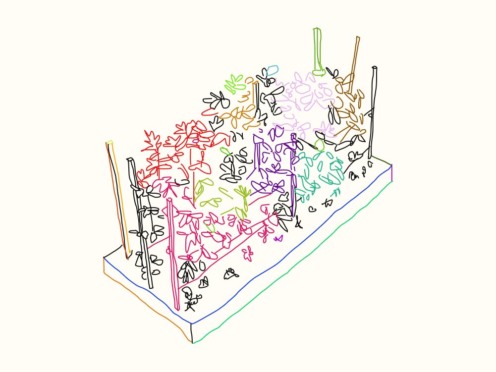
I developed a set of outline illustrations combining vegetables, fruits, and flowers to represent the diversity of the garden.
The rose becomes part of this larger system. It is integrated as one element within a broader visual world rather than a standalone symbol.

Contemporary Gardening
The color palette builds on a classic garden green as a foundation, combined with brighter accents to introduce contrast and a more contemporary feel. This balance reflects both the natural origin of the brand and its more expressive, artistic direction.

Can You Differentiate Plant Leaves?
The illustration system was designed to be flexible and reusable across different contexts—from storytelling elements to decorative overlays. Hand-drawn leaf studies, for example, can support editorial content or act as subtle visual accents.
Outcome
The result is a flexible visual identity that captures the brand’s balance between structure and spontaneity, allowing it to grow and adapt across different applications. But also gives the brand owner enough elements to play with and change over time.