
Landscape
Brand & Website Relaunch
Content Architecture & UX Simplification
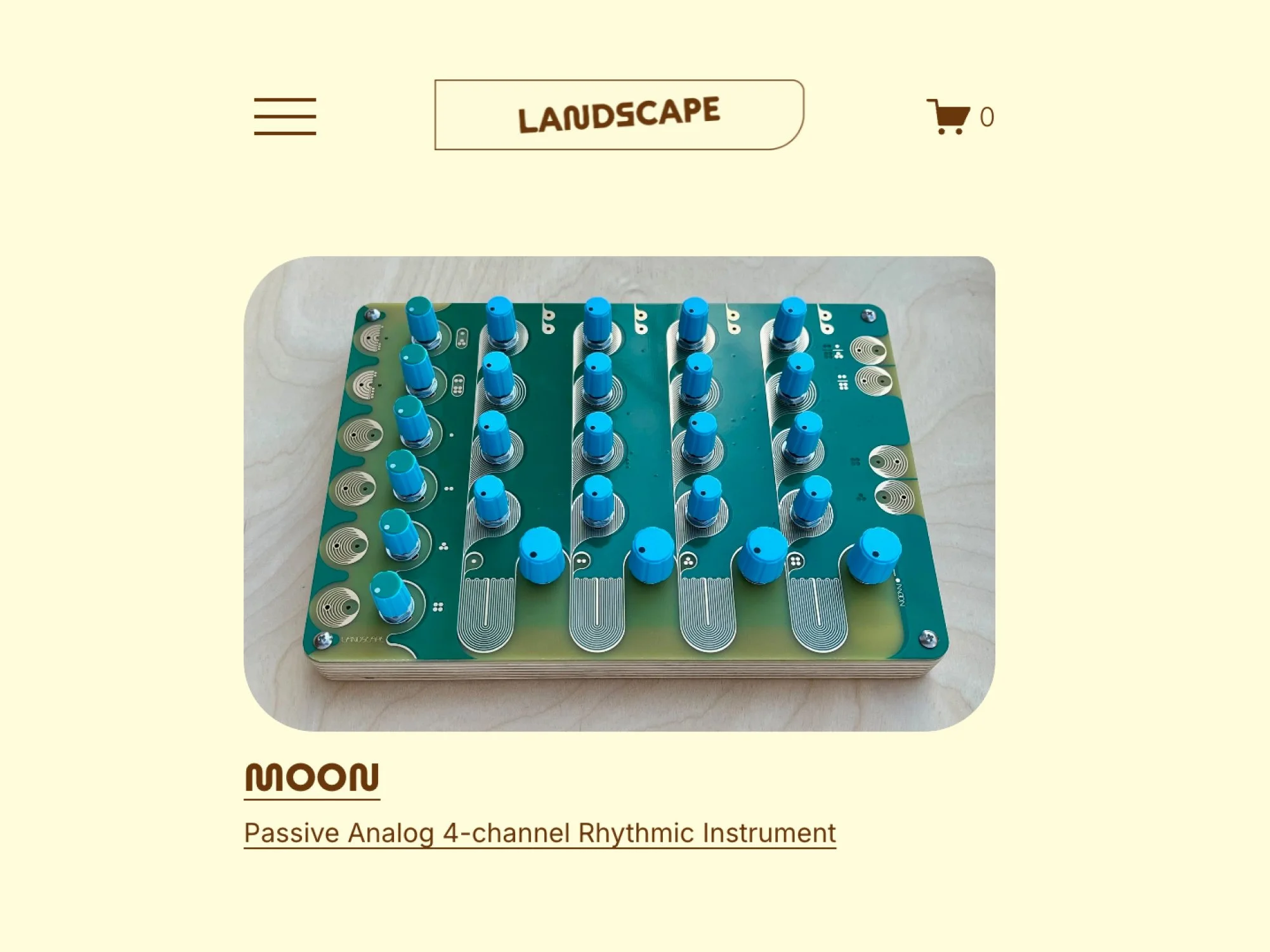
Landscape combines a highly technical product with a strong visual point of view. I brought the brand and website together into a clear system that makes the products easier to understand, explore, and buy.
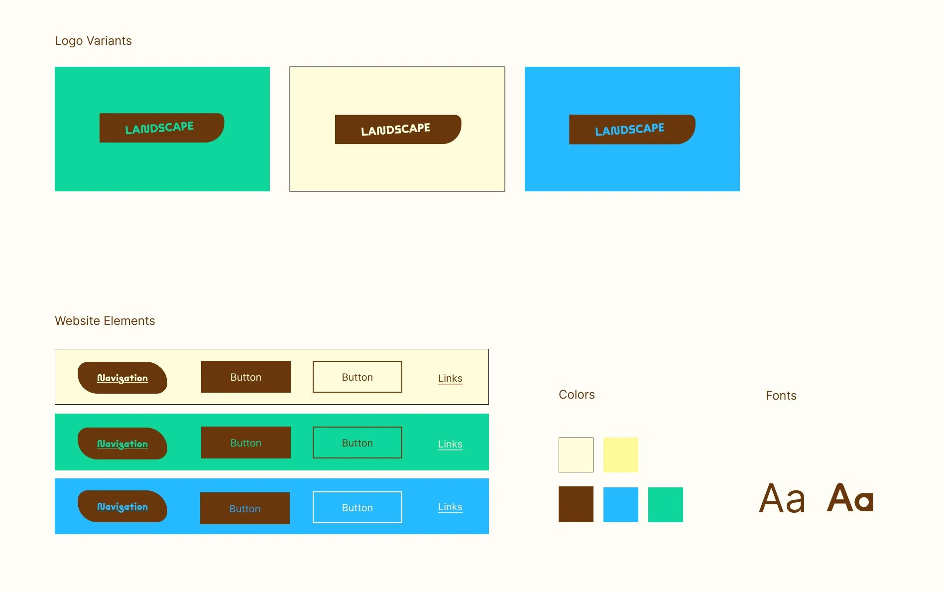
A visual system rooted in the product
Landscape’s identity is rooted in the founder’s vision of creating tactile synthesizers and his love of nature and the color brown. I translated these ideas into a flexible visual system using round, dynamic shapes and a natural color palette inspired by earth, grass, sky, and sun.
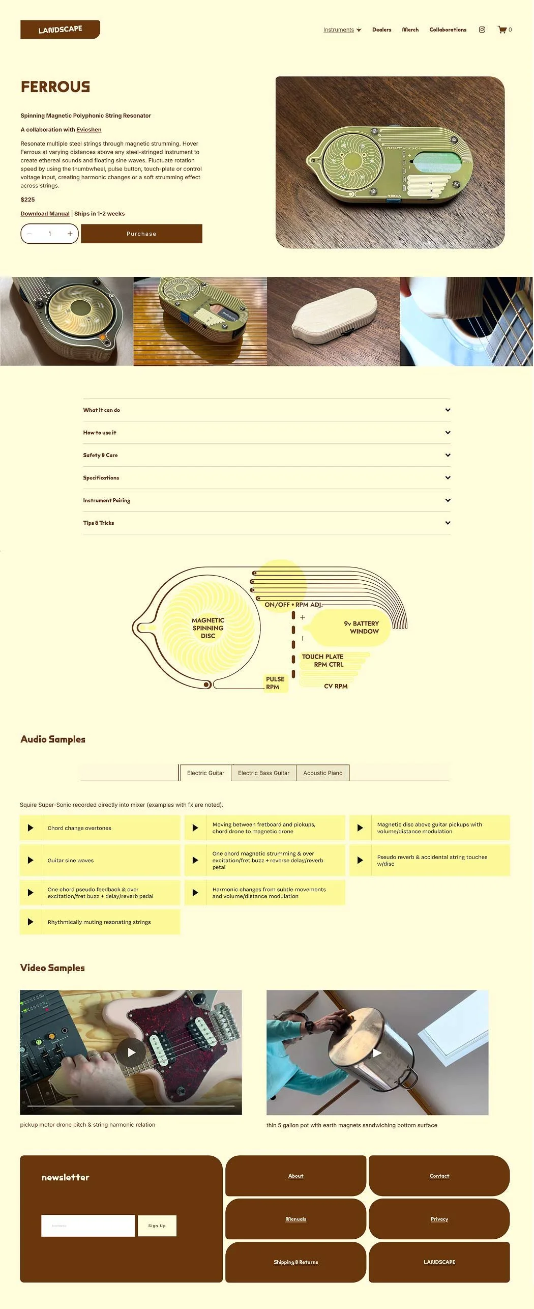
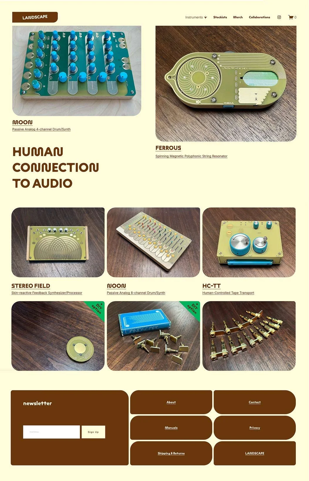
Making complex information easy to navigate
Landscape’s products come with a lot of technical information, audio, and video. I structured the content so that first-time users can understand the products while more experienced users can still find the technical details they need.
The website also needed to work as an online shop. I simplified the product pages and brought together specifications, audio, video, manuals, shipping, and returns information so customers can make a decision and buy without having to search for the information elsewhere.
Outcome
“Anna balances excellent aesthetic attention with an incredibly keen mind for organizing complex information in a way that is clear and appealing. Her redesign resulted in increased traffic and sales, and a reduction in customer questions because information is more readily available on the site. “
Eric, Founder of Landscape